Monday 29 January 2018

User centric digital learning and development

How we’ve made our learning content easier to find and easier to use. Without using a learning management system.


In the Talent and Development team at Cancer Research UK we want people to spend less time searching for our learning content, and more time using it to help us beat cancer sooner.

In this post we’ll share how we’ve made our learning content easier to find and easier to use, and what we’ve learned along the way.

We’d love to hear from you if you’re doing anything similar, have ideas to share, or any questions.

People search online to learn
As this great post by Kallidus points out:
  • “80% of people say Google or other search engines are vital to learn what they need to do their job”.
  • “Just 28% of people start their search for learning using their organisation’s LMS”.

What does this mean for Learning and Development (L&D) teams?
At Cancer Research UK we’ve taken 3 main lessons from this:
  1. As an L&D team, we can’t control how or when people learn.
  2. We could help people find useful stuff quickly by curating great content.
  3. When we want people to see our own content, we need to make it easy to find and easy to interact with. Otherwise people will give up or not even bother looking for it in the first place.
Our team has worked hard over the last couple of years to create and curate some great learning content for people to access. Like guides, videos, online discussion groups and workshops. So we decided to see how easy we could make it for our users to find.

Here’s how we’ve done it:

1. Joined forces with our Digital and Internal Communications teams

Internal Comms, because our learners’ ability to find and use digital learning content is part of their overall experience of using our internal digital platforms at Cancer Research UK. And Digital, to give us some guidance on how people use online content.


2. Started with our users

Our starting point was to understand how people found our content and what their experience was when they got there. We mapped this out with a lot of post it notes, and decided what we thought were the main pain points:
  1. People struggle to get to the learning content they want. They often end up landing on the wrong system. Then they get annoyed and do something else.
  2. If people do get to the right place (our main learning pages), they are confused by lots of words, fonts and colours. Plus the landing page content mainly promotes face- to-face sessions, most of which were fully booked. Not the message about self-directed learning that we want to send. So they get annoyed and do something else again.

3. Tested early with users

To validate our assumption that we should start by fixing these problems, we ran some usability testing. I’d highly recommend doing this. It involves getting users into a room and asking them to do some typical tasks on your system. We watched, took notes and gave them a score of 1-3 depending on how easily they could complete the task. An ‘X’ means they couldn’t do it at all.

Here’s how people got on:


People used these words to describe the page:
 

And the pages scored an overall usability score of 44.5/100. To put this in context, average is 68 and an ‘A grade’ user experience (UX) is 80.


4. Designed some new content

So we knew we needed to improve our pages. We used a digital copywriting technique, ‘KFC’ (Know, Feel, Commit). This was new to our team, and having got over the Zinger Burger cravings, we now swear by it.

First write down on post it notes everything you want your user to ‘Know, Feel and Commit to’, as a result of reading your content. Stick the post its up in a table on a flipchart.

Next, take all the post its from the ‘Know’ and ‘Commit’ columns and plot them on a Business/ User need grid.

Here’s what we put together for our new home page:


Focus: high user need and high business need
This stuff should go at the top of your page.

Guide: high user need, lower business need
This stuff should go second highest on your page.

Drive: high business need, lower user need
This stuff should go third highest on your page. You want them to read or do it, but it’s not primarily what they’re looking for.

Meh: low user & low business need
This stuff should go at the very bottom. It isn’t useful to anyone but has to be included, like terms and conditions.


5. Went where our users were

We had to work out where to host our content. To this point we’d had everything on a Sharepoint site dedicated to learning. But we decided to change to the place we knew that our users go most and feel most comfortable. To reduce the separation between 'learning' and 'work'. As David James puts it in  this post:

"It is often confused that L&D's clients are Learners, when in fact they are Workers."

We’re lucky to have a trusted intranet that’s been built with users in mind and has great search capability. It's hosted on the content management system, Drupal. So we tested what would happen if we put our new content on the intranet.

To give an idea of how much we changed things, here’s the home page that we started with:


And here's what it looks like now:


6. Usability tested again

Our hunch was that the new pages would be easier to find and more usable. We ran some more usability testing to find out. And we saw a massive improvement:


People used these words to describe the page:


And the overall usability increased to 77.9/100, well above average and not far off the UX gold standard of 80. A great improvement from a couple of weeks’ work.


7. Writing for the web

We’re now improving the rest of our pages using the KFC process and the tips that we’ve learned from our digital content team.
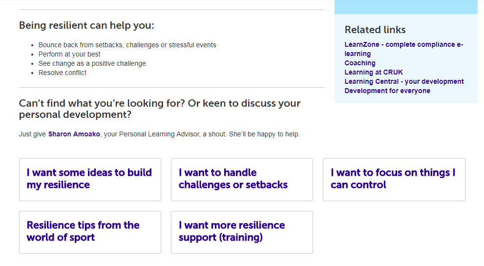
Before we start on content for any topic, we get hold of a list of people we know have come to a session on that topic. We ask them what they wanted to learn and why. Their answers help us structure our content by what our users want to hear, rather than by what we want to tell them.

An example from our personal resilience page:


What’s next?

We know from our testing that our pages are now easier to find and more usable. So people waste less time searching for learning content, and can spend more time doing jobs to help beat cancer sooner. Early signs are that more people are accessing the pages too. We're gathering qualitative feedback and continually improving the content.

We're also looking at learning management systems to help us recommend content and training to staff. But any new system needs to enhance the existing user journey, not replace it. It has to work for the user or there's little point in having it.

As anyone who’s read anything by Jane Hart will know, modern workplace learning is much more than making existing learning opportunities ‘digital’. We need to help people take control of their own learning, not wait for it to be arranged for them.

All of our content aims to encourage this kind of behaviour. It won’t get us there on its own, but it will help if it’s easy for our users to find and easy for them to use.

Ed Willis
Learning Designer

Thursday 18 January 2018

How can you learn if you don’t test?

Even in my few years of working in fundraising and marketing here I’ve noticed a real shift in mind-set from the very top. We’ve stopped thinking we know everything! Instead of thinking we’re right without question, we’ve adopted an approach where our decisions are increasingly based on insights. We’re listening to our supporters more than ever and they inform the direction in which we move.

Stop being so vague and give us an example

Ok, ok. I’ll cut to the chase. I joined a Digital Spoke in 2016 to help design and develop a personal account for our supporters to use. Without going into the exact details of the product, it changed our team’s way of working beyond just this project. We worked in synergy with the Digital team and learned so much about adopting an agile approach to tasks while also gaining a huge amount of experience of different digital tools!

But I don’t want to talk to you about all of that. As exciting as it was, I think the way our team worked independently post-Spoke is the most impressive part of the project.

What’s so great then? Spit it out already!

The first thing we did was to maintain our daily stand ups which helped keep everyone focused. Each morning we huddled around a screen which showed all of the bitesize cards on our Trello board and we’d assess their progress. Reviewing this frequently really helped to keep things front of mind while also holding people accountable for completing tasks.

Both before and during our series of recruitment communications we held testing plan meetings where we could vote for which ideas we wanted to test using an effort vs. impact matrix. Where possible we’d go for what we felt were low effort, high impact tests! By holding these meetings in between each recruitment drive they also acted as an evaluation of the previous tests which was very useful context for planning.

What about when people signed up?

During the Spoke we gained a lot of experience at creating and manipulating dashboards and custom reports on Google Analytics. This allowed us to understand in real time how users were interacting with the product, what was working well and where we should be focusing our attention. Of course we sought expert advice for more difficult queries, but for the most part we were self-sufficient which was very encouraging.

Some of the trends we spotted through analytics caused us to implement real time optimisation tests. For example, when we spotted a dip in the conversion rate on the registration form we A/B tested different wording and infographics using Optimizely in an attempt to bring this up again.

How did people know what you were doing?

One of the key principles of agile working is to share progress and learnings with stakeholders and the wider organisation. Although we did this regularly with key stakeholders, we wanted to improve how we communicated to the wider organisation. It required an adjustment to how we approached the project but it definitely helped improve our skills and confidence at presenting. We’d give engaging updates every two weeks or so where anyone could show up and listen. The best thing about them was the questions we’d get asked which provoked thoughts and ideas we hadn’t previously considered.

To make this more accessible, we’d record the presentations and upload them to our Wiki page which increased our reach. This also allowed us to re-watch each one retrospectively to hone and improve our public speaking skills.

So what’s happening next?

This is a really exciting time to be working for Cancer Research UK. The direction we’re moving in as a charity is becoming inevitably more digital and we’re facing this challenge head on by devolving skills, knowledge and expertise into the product and marketing teams. This success of this Spoke is simply one example. The way we’ve carried these skills on post-Spoke and continued this way of working has really helped to take this project from strength to strength – but this is a process that is becoming more prevalent in all areas of the charity.

Graham Goodings
Digital Producer


Tuesday 2 January 2018

Writing for the Web at Cancer Research UK

A few weeks ago at Cancer Research UK we had the 200th person attend our ‘Writing for the Web’ course. After celebrating with a ticker-tape parade and a commemorative Twix, it got me reflecting on the course, and why we started running it in the first place.

We’ve written a bunch of stuff about our digital devolution model, and how we aim to make digital a core part of everyone’s job at the charity. And a key part of this is how we communicate our brand online.

So my team started a 2 hour workshop for anyone who publishes content on our website. And, because we have the skills to deliver this internally, it means we can be flexible and run the course as often as needed - without spending money on external training providers.

So what’s covered?

Write the way your users read

Most people get that print and digital content are different. We understand that reading this blog on an iPhone is a fundamentally different experience than reading an article on copywriting in a magazine. 

But, what we sometimes don’t recognise is that as readers, we have fundamentally different attitudes to how we approach content in print and digital. 

Someone much smarter than me called Jakob Nielsen did a bunch of research using eye tracking software to record how people read content online.

He found that, whereas with traditional print content we (in European languages at least) read left to right and top to bottom, in digital we tend to scan around the page in more of an ‘F’ shape.


As users we go to websites with a specific problem, and we’re scanning the page to get the ‘gist’ of how well the page we’re on will solve that problem for us.

So our content needs to make it clear to users how we’re meeting their needs at a glance. They won’t take the time to wade through irrelevant or hard to understand information to get what they’re looking for. If they aren’t convinced our content will help them they’ll just leave.

Which is why we need to make it clear how our content will benefit our users.  

Write for your users, not for you

There’s an old saying in copywriting, “features tell, but benefits sell”. The idea is that just explaining what your product or service is won’t engage your users. Instead you need to explain how it will make your users’ lives better.

This is the most important thing about writing for digital. If you can relentlessly focus on how your content is going to help your users, rather than how your content is going to help your organisation, it’s the quickest way to improve its performance.

So what does this look like?

Well, imagine for a second you’re a humble pie maker, who wants to promote a competition on your website, www.piespiespies.com. 


You might use this as your opening line:

To celebrate 10 years in business, we’re running a competition to win free pie for a year.

Here, the focus is very much on your business. It’s a statement of fact, and it’s written from the perspective of your business. It’s feature-led.

Now imagine an alternative opening line:

Win free pie for a year with our anniversary competition.

Here the focus is on what the competition will do for your user. Does your user care that your business has been around for 10 years? Probably not. Do they care about free pie? Well, who doesn’t? So this sentence is more benefit-led.

Ok, great - but why is this important?

Well, think about it in context of scan reading. If a user’s quickly skimming your page, you’ll want to draw their attention to relevant content as quickly as possible. And they’re much more likely to engage if they can see, at a glance, what’s in it for them. 

Then, once we’ve got their attention, the next thing we need to do is make sure we express ourselves in a way that’s easy to understand. Which is where Plain English comes in. 

Write the way you talk 

Back when I started my career, I used to worry about how seriously people would take my writing. I used to think that to sound credible I needed to use lots of long, complicated words. After all, that would help me come across as smart and authoritative, right?

Well, actually, the opposite was true. By loading my writing with complicated phrases I wasn’t coming across as smart. I was coming across as confusing and difficult to understand.

Sarah Richards is another person much smarter than me, and she makes the point that writing in Plain English isn’t dumbing down content, it’s opening it up. Because if we know our users scan information online, and we know they react better to clear, benefit-led sentences, then why wouldn’t we try and make our writing as clear and concise as possible? 

At Cancer Research UK, our guidance on Plain English is pretty straightforward:
  • Keep your sentences short (20 words max) 
  • Use a maximum of 3 sentences per paragraph
  • Only discuss 1 thing per paragraph (it’s easier to scan that way)
  • If you have the choice between a long word, and a short word that means the same thing, then always pick the short word
If in doubt, a good rule of thumb is ‘write the way you speak’. This doesn’t mean talking the same way you would to your friends at Friday night drinks. Instead, think about how you’d explain your content to your users over a coffee and a Twix. What words would you use? How would you speak? 

I imagine you’d be friendly, straightforward and to the point. I also imagine you wouldn’t use phrases like ‘for further information please direct any inquiries to our helpline’. I mean, you might, but you’d come across as slightly robotic if you did.

A great tool you can use to check how clear your writing is, is Hemingway App. It’s a free, online word processor, so you can type straight into your browser window. And, as you type, Hemingway grades how easy your writing is to understand and suggests improvements. The lower the score the better, and if you aim for a score between 6 and 8 you’ll find your content is doing pretty well.

Write better by writing more often

This is just a snapshot of the content training we offer at Cancer Research UK, and as far as content strategy goes it’s one piece of the wider puzzle.

Before you sit down and create your content you’ll need to make sure it answers a clear user and business need. You’ll need to make sure it has appropriate governance so it doesn’t all fall apart once it’s been published. And you’ll need to make sure you regularly test it so you know it’s still doing the job it should.

However, what this training does give teams is a solid grounding in the skills they need for writing for the web. Will they create world class digital content straight away? Well, probably not – it’s kind of hard to after a 2 hour introduction course. 

But writing something that’s a solid base is a great first step. Then based on users’ feedback you can always improve, iterate and optimise your content over time. Plus, bear in mind the only way you’ll become a better writer is by writing. And if your content is in plain, straightforward English that speaks to your users’ needs, it’ll already be better than a lot of content online. 

Chris Flood
Content Strategy Lead